Back to main Blog

Richard Meyer
CTO
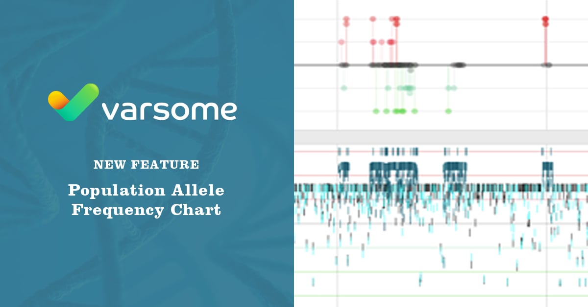
Today we are announcing a new feature - Population Allele Frequencies Chart, combined with the lollipop graph for genes, which is now directly visible in VarSome’s genome browser using a log scale. This can be useful in parallel with the pathogenicity lollipop graph [Fig 1].
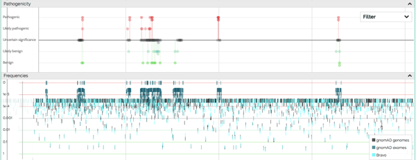
Figure 1. BICD2 Allele frequencies chart.
'BICD2 is a gene for which few benign variants have been reported, so population variation is crucial to visualize patterns of disease-causing variants. Notice that the pathogenic/likely pathogenic variants tend to cluster in mutation hotspots with blue-green “spikes” of low frequency population variation. These correspond to BICD2’s key interaction regions where missense variants can be disruptive. Outside of them, missense variants tend to be benign. Very useful to see that recapitulated in VarSome’s plots.' says Daniel C. Koboldt, Principal Investigator, The Institute for Genomic Medicine at Nationwide Children’s Hospital, and Assistant Professor of Pediatrics, The Ohio State University.
Let us know what you think!
As ever, we hope you find these new features useful, and look forward to any feedback or suggestions you may have. You may leave a comment right here or get in touch with us.
Submit a Comment